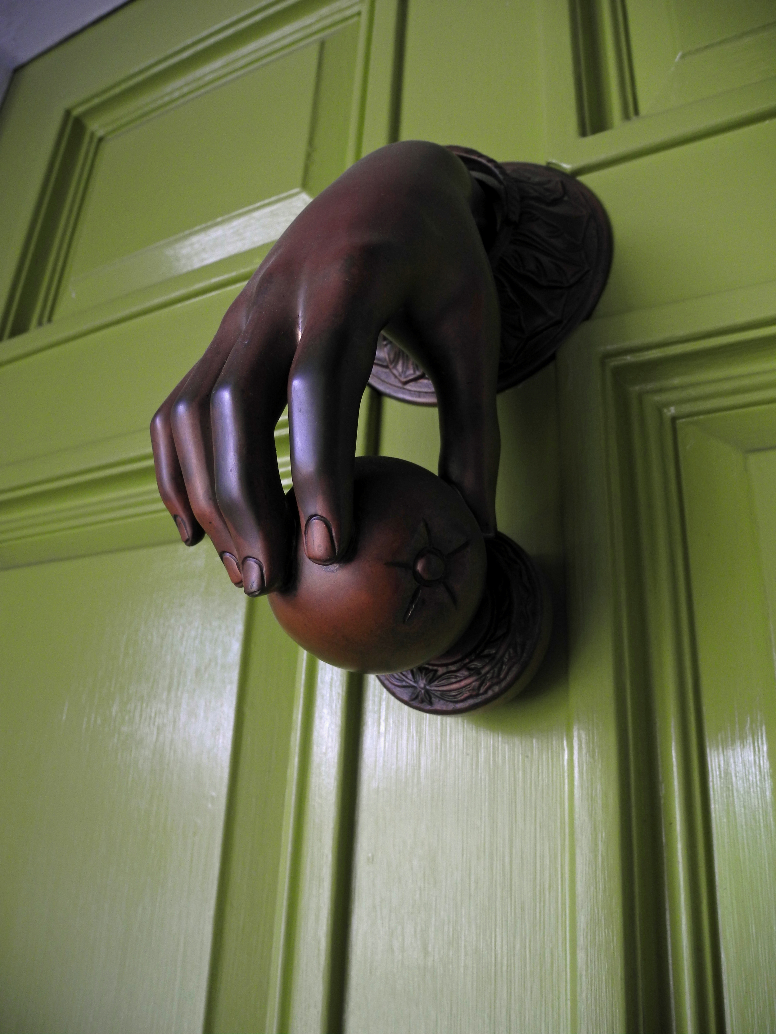
From the moment you approach Lola's front door - lacquered in apple green and bearing a bronze knocker of a life-size hand holding an apple, you know you are in for a design treat. Today, we tour the Berkeley Hills home of my dear friend and style maven, Lola Thompson. Lola is fearless in her use of color and pattern and mixing design eras throughout her 1930s home, and the result is chic and awe-inspiring. The rooms seamlessly pair Vernon Panton chairs with antique French gilded chairs in perfect harmony. Lola feels that nothing is too grand in scale for this bungalow style home, and, boy, is she right. The oversize mirrors and museum worthy paintings make the rooms feel inviting and voluminous. Too balance things out, she mixes metallics to soften the room and layers antique details for a sense of intimacy.
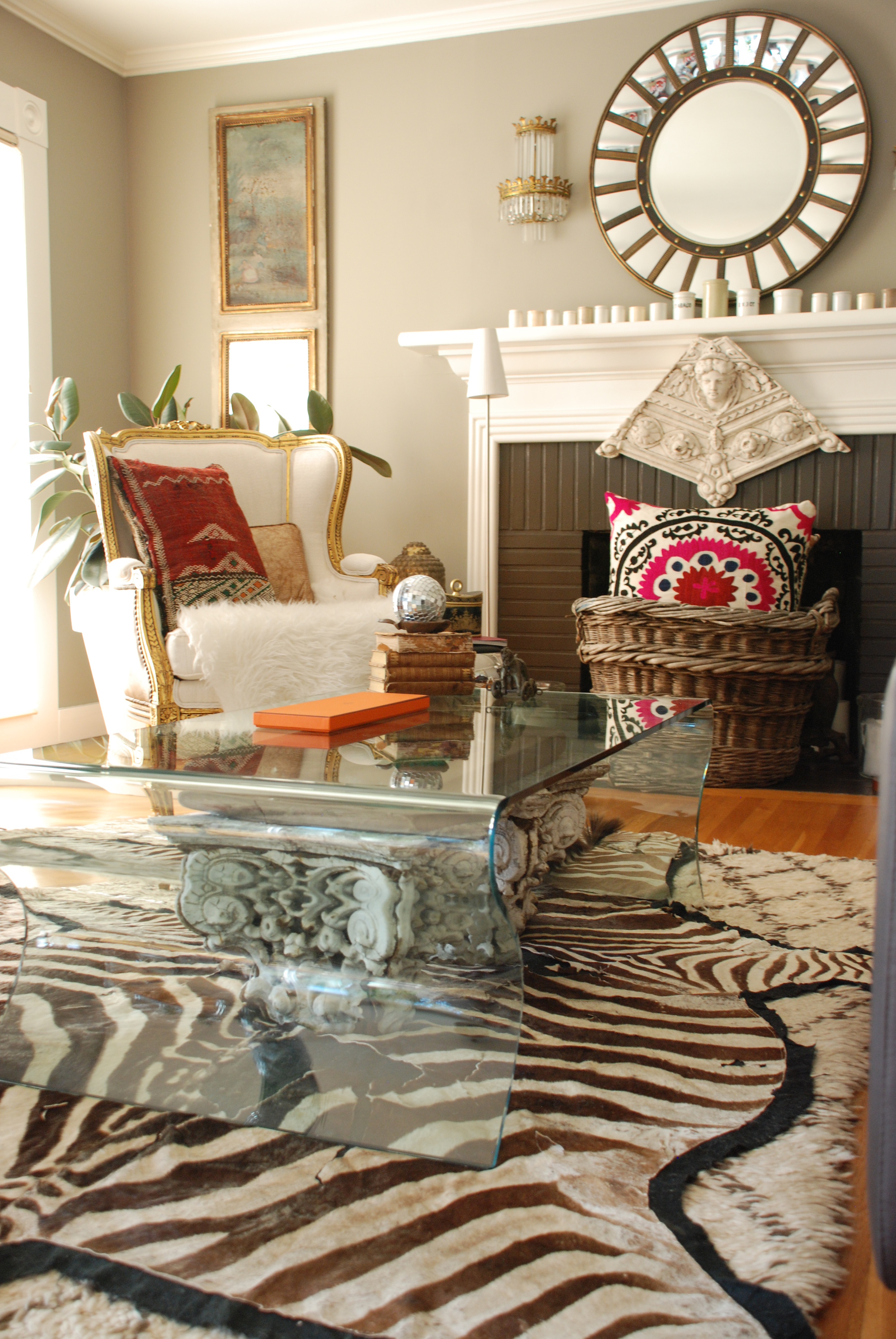
Architectural capitals are visible beneath the DWR glass coffee table.
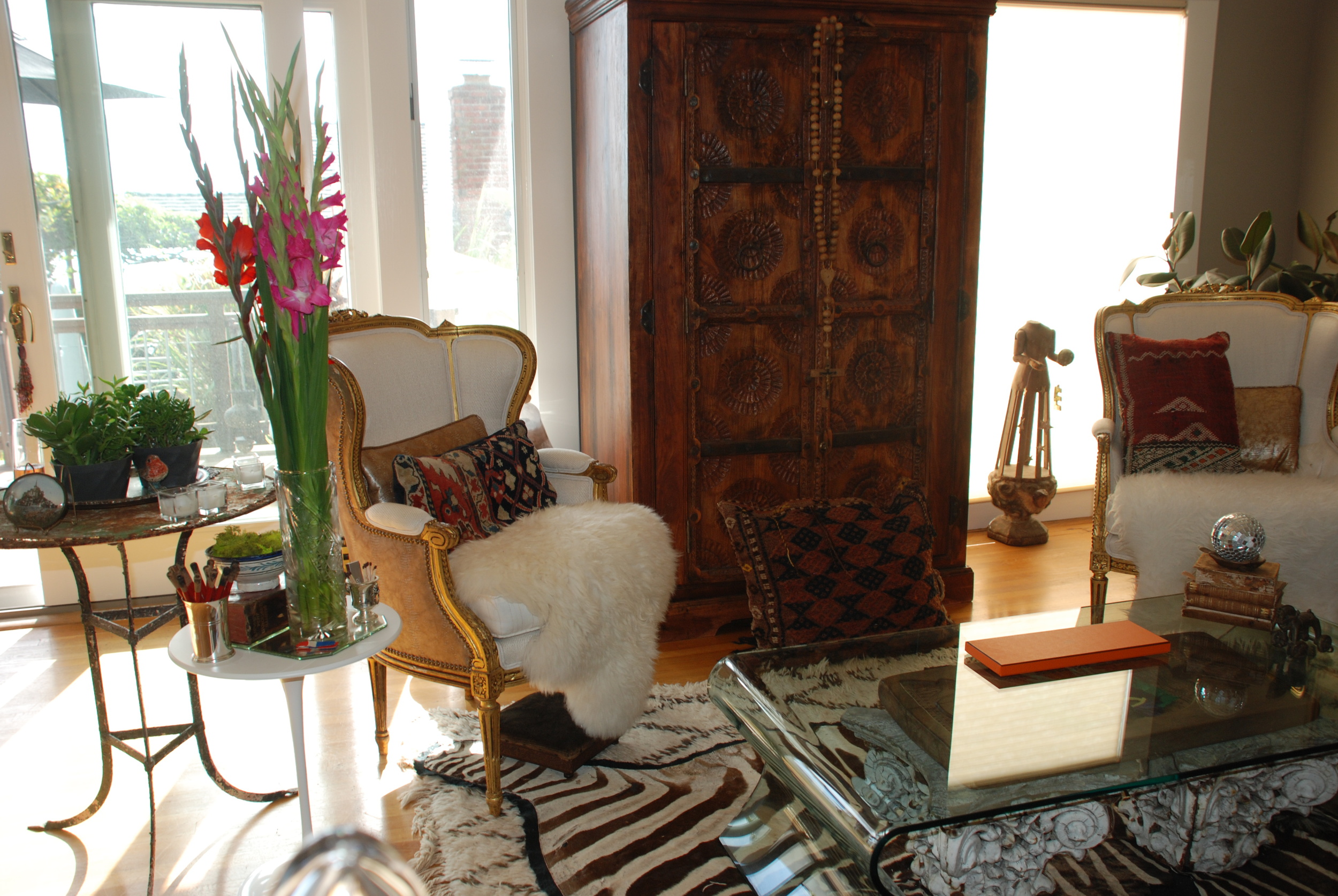
I love the juxtaposition of the modern Leolux leather couch against the antique French gilded chairs. The straight lines of the couch are softened by the layering of vintage velvet pillows made from scraps of material Lola found in France, classic Scalamandre tiger print pillows, and a sheep skin. Lola breaks all the rules by layering a zebra rug on top of an antique Moroccan rug. The result is trés chic.
Muted abstract painting is the perfect backdrop for the living room.
Vintage Mt St. Michelle souvenir on a lovely rusty table.
Religious cloche occupies a living room table.
Lola brings a sense of balance to the rooms with symmetry. Whether with chairs, accessories or sconces, symmetry brings a balanced calming appeal to each of her rooms.
Visitors are greeted at the entry with ornately adorned Thai statutes.
A colorful graphic painting presides over the dining room. Lola felt the bold modern painting was appropriate for the style of the house, but wanted the room to feel relaxed, so she brought in a fragmented plaster horse leg and white Vernon Panton chairs paired with antique French gilded chairs from a Paris flea market. A round dining table (made from an antique Chinese drum) draped with a Moroccan wedding blanket, books piled high, and stunning petite statuary is another example of Lola's fearless layering to perfection.
Fragmented plaster horse leg softens a graphic painting.
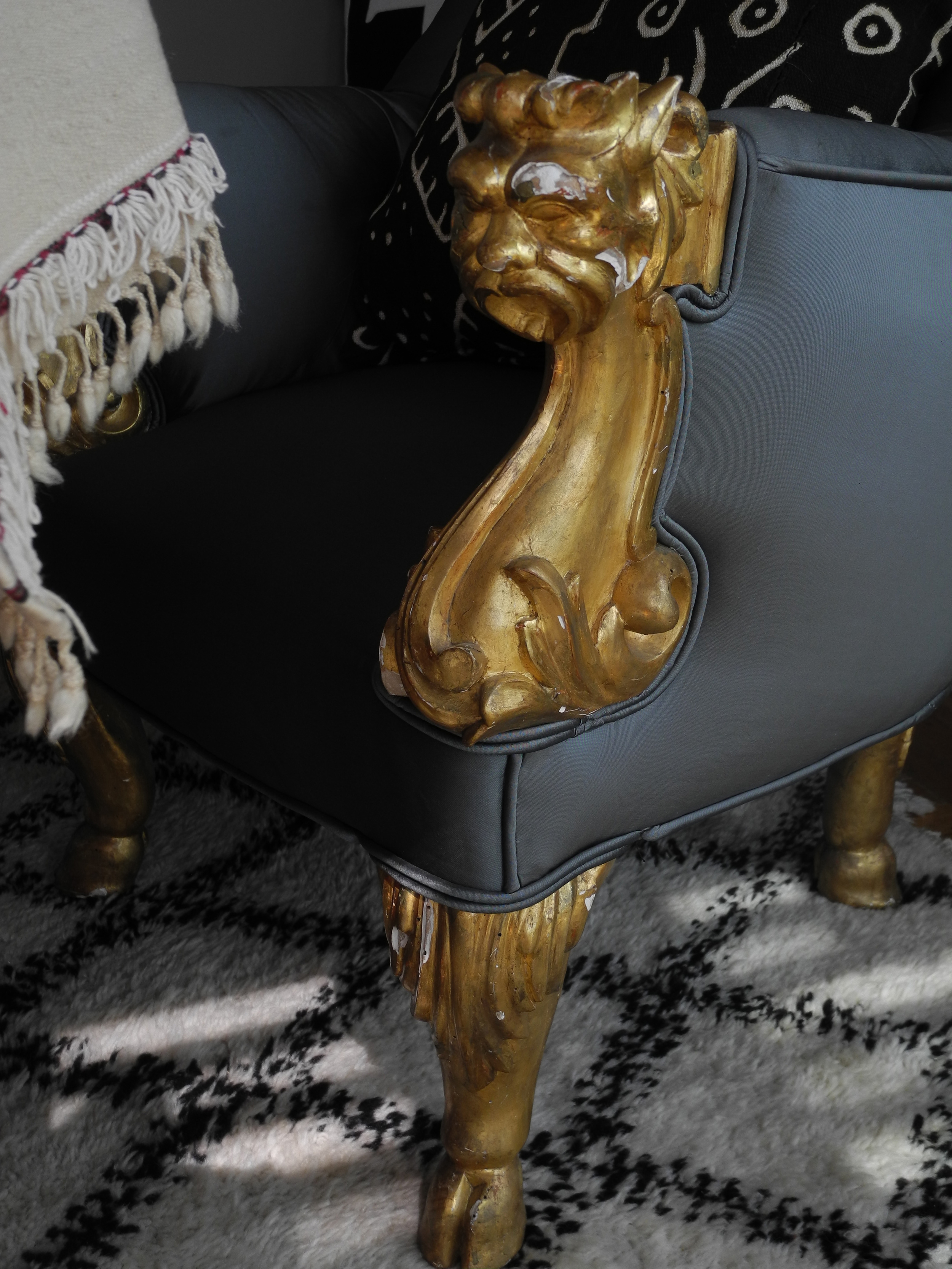
Gilded details on antique French dining chairs.
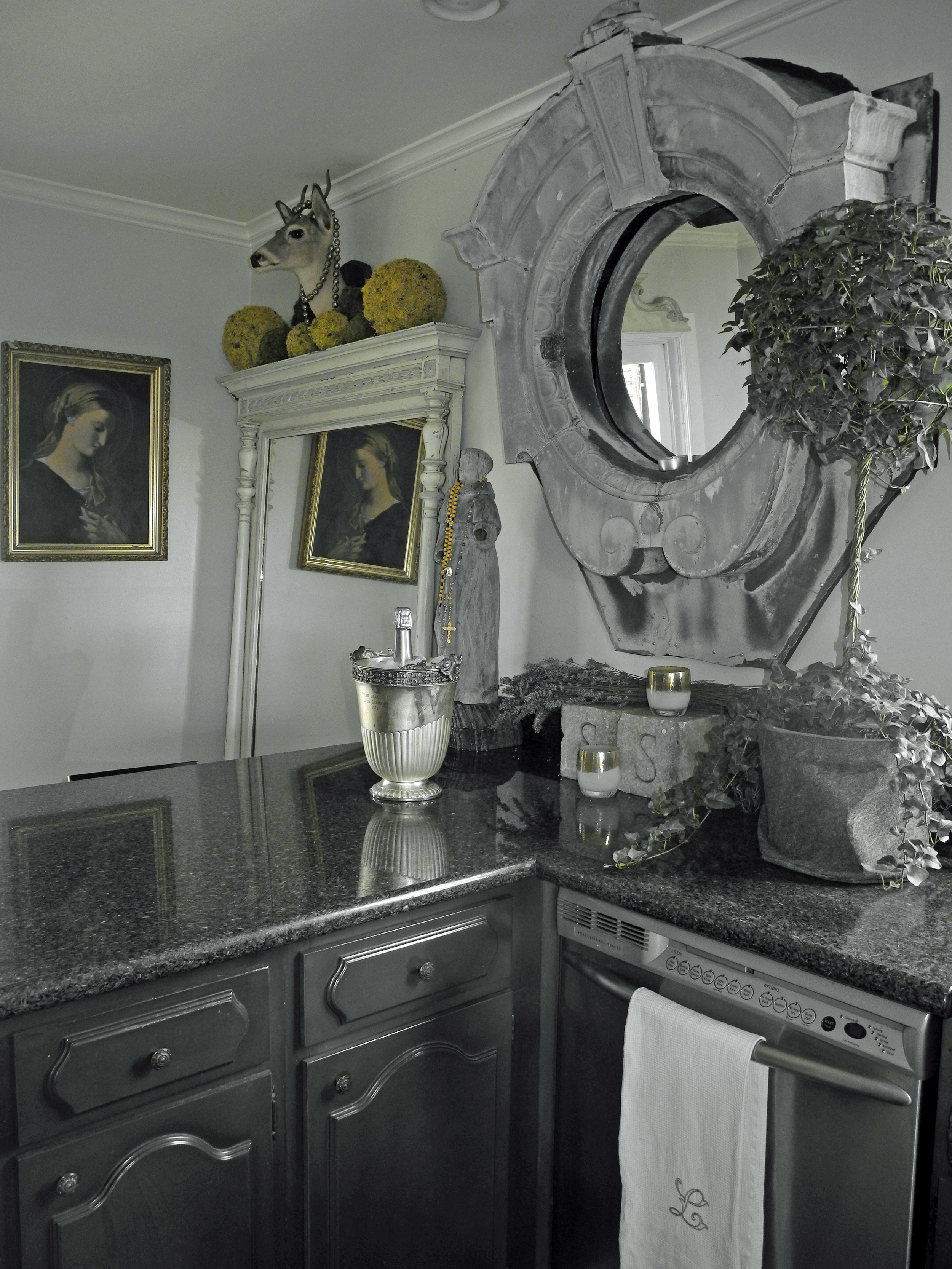
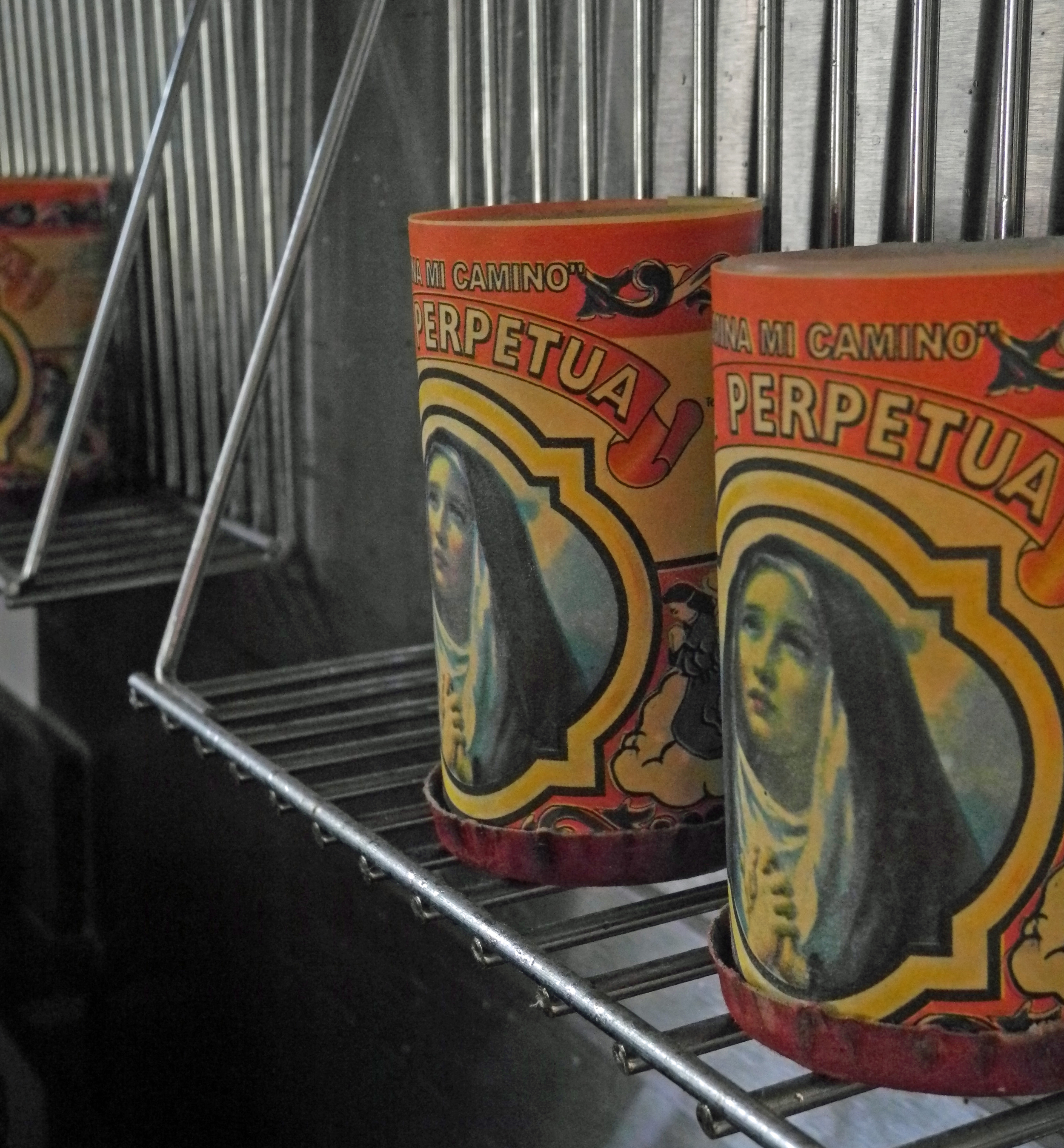
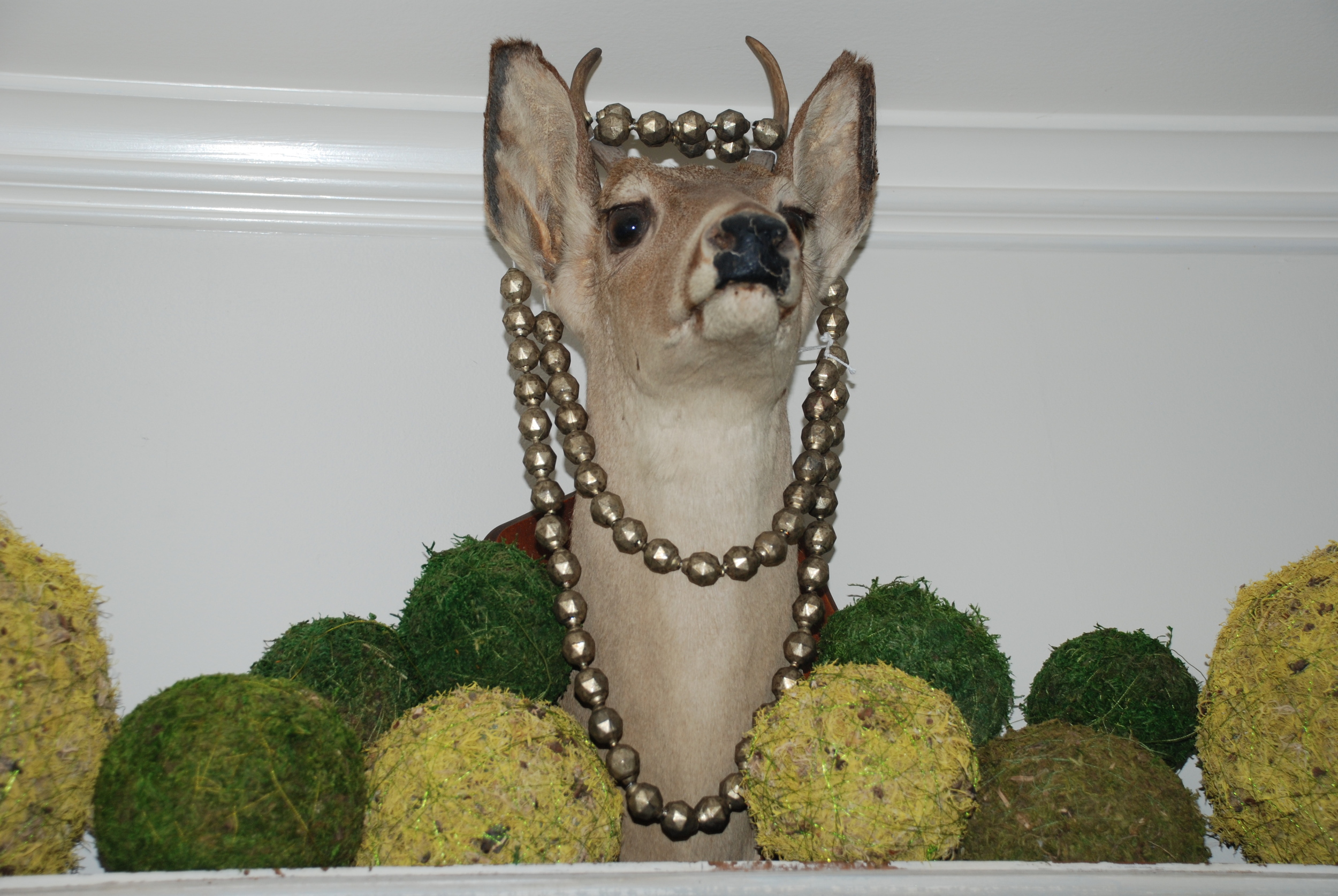
Lola is a pro at converting objects to "objet d'art" and creating unconventional spaces by bringing the unexpected into the space – such as the taxidermy and an antique zinc French dormer window in the kitchen. The top of the refrigerator becomes an ad hoc library display and the stove backsplash a religious candelabra of sorts. Lola has plans to renovate the kitchen, but, in the mean time, she has created an eye-popping kitchen with her curated artifacts.
An unconventional kitchen featuring taxidermy and statuary.
Lola continues the unexpected into the bathroom. An oil painting hangs above the bathtub, Virgin Mary (adorned with a vintage rhinestone necklace) presides over the bathroom, and an antique Persian rug folded in half becomes a runner.
Oil painting hangs above the bath.
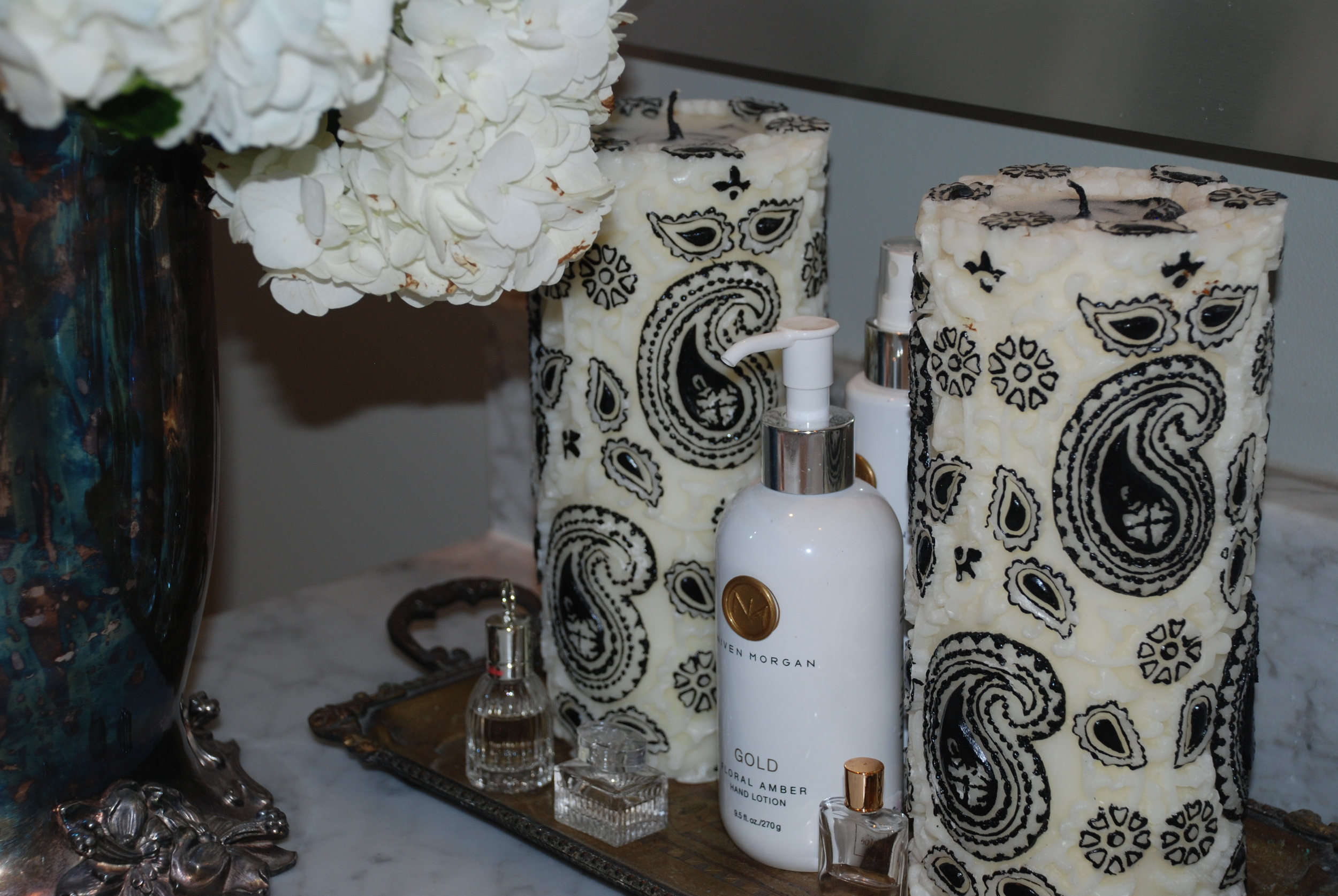
Guests are pampered with boutique worthy toiletries.
Monogrammed details in the bathroom.
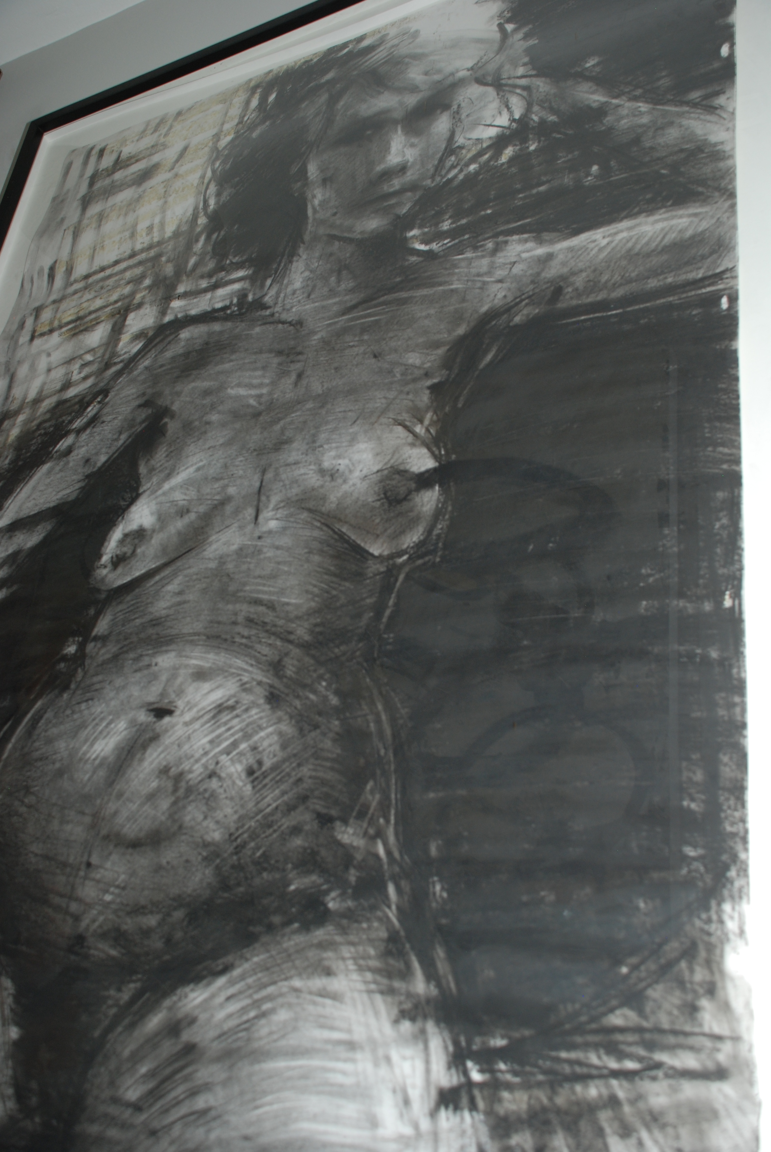
Lola manages to transform a narrow hallway into an exciting corridor that transitions the visitor from one exciting space into another. A large charcoal nude scored at an auction greets visitors in the hallway, and is juxtaposed against a rosary.
Charcoal nude hangs in the hallway.
Rosary layered on drapery.
Each and every space includes at least one show-stopping piece – an antique, architectural artifact, eye-catching modern painting or pattern. Together they create a stunning example of how to achieve a rich layered look that welcomes the eye without overwhelming the senses.
Lola's house is nothing short of a triumph, a study on how to successfully layer and use scale in a small space. It's hard to pick a favorite room. Do you have one?
Style Notes
- Layering can easily turn from chic to cluttered; avoid a sense of chaos by grounding the space in a neutral backdrop color.
- Mix different fabrics and patterns. The same rule of thumb applies here as when layering clothes - mix high and low (think sequence with cotton), non-competing colors (e.g., bright pink and leopard may be a bit too much), and incorporate a neutral to visibly break the pattern (think a white t-shirt under a striped blazer).
- Soften angular structured lines of modern furniture with sheepskin, hides and velvets.
- Use patterns, artwork and furniture of multiple scales to avoid the room looking flat.
- Incorporate the things that you love and at least one statement piece. If you love it, you'll find a place for it!


